Mixing Typefaces + a needed update
Wednesday, July 22nd, 2009
I am a bit of an idiot when it comes to print typography. On the web the choices have historically been limited and knowing the difference between san/serif has been enough. But, the times are slowly changing…
The Classic Resource
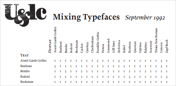
A coworker introduced me to this nice little cheat sheet was created in 1992. Although dated, many of the widely used web fonts are listed. In the chart, a number from 1 to 3 appears where each pair intersects. 1 means that the two fonts are compatible, 2 means that with proper implementation the two fonts could work well together, and 3 means that they will clash.
The chart is very useful, but is presented in such a way that would make Tufte cry. Issues include:
- No representation of what the font actually look like
- Numbers 1-3 are not good visual indicators of good-bad
- Very, very hard to figure out what row/column you are on.
- What is Text vs. Display anyway?
- Why does Quorum come before Optima in an ordered list.
Time for an Update
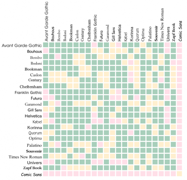
I put together an interactive draft that you can find here (the image below is not interactive). Not all the issues are solved in this 0.1 version, but it is much more useful.
By the way: display (denoted by columns) means headings and text (denoted by rows) means body text, etc…


