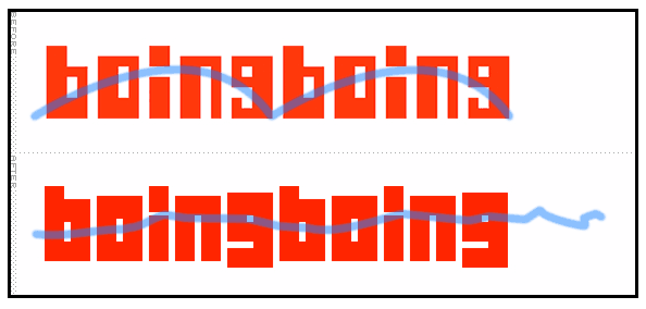
boingboing logo
Tuesday, November 3rd, 2009
One of my favorite blogs: boingboing asked for a critique of a logo change.
My 2¢’s? The new logo looses a visual bouncing reference created by the letter height and whitespace. See what I mean below:

Also, the before conforms to a smaller grid of pixels 7×45 if I’m not mistaken. The after would take twice that.
