
 boingboing logo
Tuesday, November 3rd, 2009
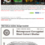
One of my favorite blogs: boingboing asked for a critique of a logo change. My 2¢’s? The new logo looses a visual bouncing reference created by the letter height and whitespace. See what I mean below: Also, the before conforms to a smaller grid of pixels 7×45 if I’m not mistaken. The after would take […]
 Bryan ♥♥ Soumintone
 Social Media – Getting Your Message Out
 Simple Preview (Plugin for WordPress)
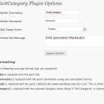 TwitCategory (Plugin for WordPress)
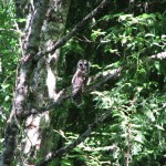 Owls have crazy eyes
 Pear Cider (Process and Recipe)
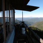 Bull of the woods Fire Tower
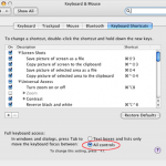 Firefox respects Macintosh preferences, disrespects users
 Mixing Typefaces + a needed update